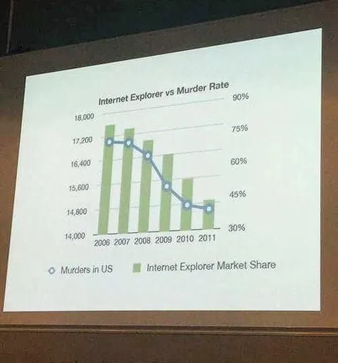
Internet Explorer vs Murder Rate
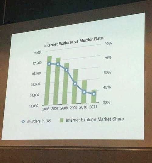
Internet Explorer vs Murder Rate 18,000 17,200 16,400 15,600 14,800 14,000 90% 75% 60% 45% 30% 2006 2007 2008 2009 2010 2011 Murders in US Internet Explorer Market Share
A projected chart humorously compares the declining Internet Explorer market share with the declining number of murders in the US from 2006 to 2011. The joke falsely implies that Internet Explorer prevented murders, mocking misleading correlation charts and confusing correlation with causation. EN: A projected chart humorously compares the declining Internet Explorer market share with the declining number of murders in the US from 2006 to 2011. The joke falsely implies that Internet Explorer prevented murders, mocking misleading correlation charts and confusing correlation with causation.
projector screen / экран проектораline chart / линейный графикbar chart / столбчатый графикgreen bars / зелёные столбцыblue line / синяя линияchart legend / легенда графикаpercentage axis / процентная шкалаyear labels / обозначения годовwooden wall / деревянная стенаprojected presentation / проецируемая презентация
- @profunctor_io / 1470 2018-11-18
- Template
- misleading correlation chart
- Type
- image
- Size
- 500×536 · 37.8 KiB
- Mood
- absurd, sarcastic
- Language
- en
- Added