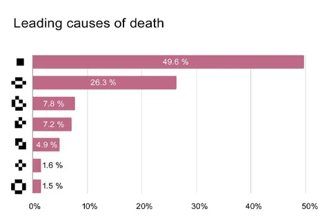
Leading Causes of Death Chart
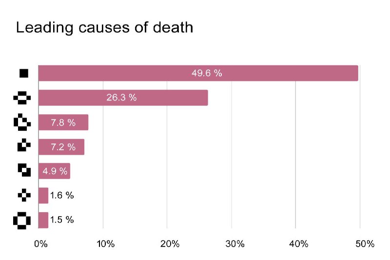
Leading causes of death 49.6 % 26.3 % 7.8 % 7.2 % 4.9 % 1.6 % 1.5 % 0% 10% 20% 30% 40% 50%
A bar chart titled “Leading causes of death” shows several percentage bars, but the categories are represented only by mysterious pixelated icons. The joke comes from presenting an apparently serious statistical chart while hiding or replacing the actual causes with cryptic symbols.
- @dev_meme / 6931 2025-07-01
- Type
- image
- Size
- 800×533 · 28.2 KiB
- Mood
- absurd, mysterious
- Language
- en
- Added