macOS Users Designing Linux Themes
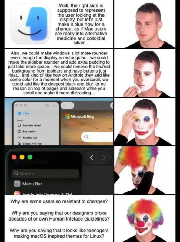
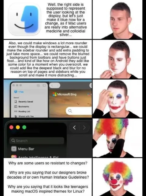
Well, the right side is supposed to represent the user looking at the display, but let's just make it blue now for a change, as if Mac users are really into alternative medicine and colloidal silver... Also, we could make windows a lot more rounder even though the display is rectangular... we could make the sidebar rounder and add extra padding to just make space... we could remove the blurred background from toolbars and have buttons just float... and kind of like how on Android they add like some color for a moment when you overscroll, we could add like the deepest black and blur for no reason on top of pages and sidebars while you scroll and make it more distracting... Why are some users so resistant to changes? Why are you saying that our designers broke decades of our own Human Interface Guidelines? Why are you saying that it looks like teenagers making macOS inspired themes for Linux?
A multi-panel joke shows a man progressively applying clown makeup while a macOS-style interface is redesigned with increasingly unnecessary rounded corners, blur, padding, colors, and distractions. The punchline is that these changes violate Apple's own Human Interface Guidelines and resemble amateur macOS-inspired Linux themes, so the image is used to mock questionable UI redesigns and users who resist them. EN: A multi-panel joke shows a man progressively applying clown makeup while a macOS-style interface is redesigned with increasingly unnecessary rounded corners, blur, padding, colors, and distractions. The punchline is that these changes violate Apple's own Human Interface Guidelines and resemble amateur macOS-inspired Linux themes, so the image is used to mock questionable UI redesigns and users who resist them.
- @gentoomemes / 18715 2025-09-23
- Type
- image
- Size
- 594×800 · 99.2 KiB
- Mood
- sarcastic, absurd
- Language
- en
- Added