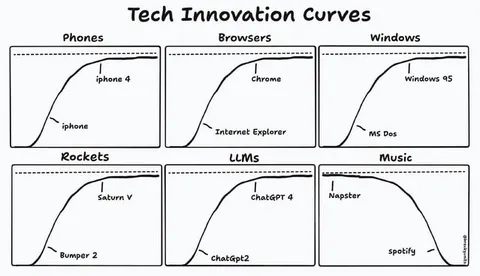
Tech Innovation Curves
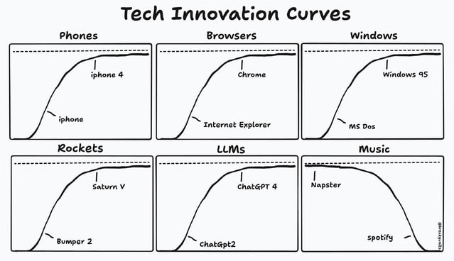
Tech Innovation Curves Phones iphone iphone 4 Browsers Internet Explorer chrome Windows MS Dos Windows 95 Rockets Bumper 2 Saturn V LLMs chatGpt2 ChatGPT 4 Music Napster spotify
A six-panel hand-drawn chart compares technology adoption or innovation curves across phones, browsers, operating systems, rockets, large language models, and music services. Each panel shows an older technology rising toward a plateau and a newer successor reaching the same ceiling, while the music panel reverses the pattern with Napster declining as Spotify rises. The joke is that technological progress often appears cyclical, with new products replacing old ones in absurdly simplified curves.
line chart / линейный графикsix-panel grid / сетка из шести панелейphone / телефонweb browser / веб-браузерcomputer operating system / операционная система компьютераrocket / ракетаlarge language model / большая языковая модельmusic streaming service / музыкальный стриминговый сервисdashed horizontal line / пунктирная горизонтальная линияrising curve / восходящая криваяfalling curve / нисходящая криваяblack text / чёрный текстwhite background / белый фон
- @gentoomemes / 16911 2025-04-16
- Type
- image
- Size
- 639×368 · 32.0 KiB
- Mood
- satirical, absurd
- Language
- en
- Added