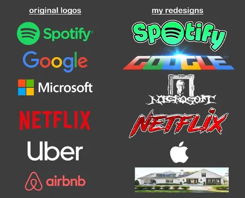
Original Logos vs My Redesigns
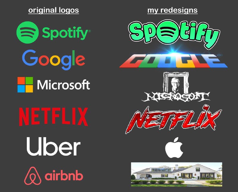
original logos my redesigns Spotify Google Microsoft NETFLIX Uber airbnb Spotify Google Microsoft NETFLIX Apple
A side-by-side comparison shows the original Spotify, Google, Microsoft, Netflix, Uber, and Airbnb logos next to exaggerated redesigns. The joke is that the redesigns become wildly different styles, including a distorted Google logo, a gothic Microsoft logo, a heavy-metal Netflix logo, and an Apple logo replacing Uber and Airbnb. It is used as a humorous reaction to overly dramatic or misguided rebranding. EN: A side-by-side comparison shows the original Spotify, Google, Microsoft, Netflix, Uber, and Airbnb logos next to exaggerated redesigns. The joke is that the redesigns become wildly different styles, including a distorted Google logo, a gothic Microsoft logo, a heavy-metal Netflix logo, and an Apple logo replacing Uber and Airbnb. It is used as a humorous reaction to overly dramatic or misguided rebranding.
- @gentoomemes / 13524 2024-09-23
- @memetutorial / 18772 2024-09-23
- Template
- Logo redesign comparison
- Type
- image
- Size
- 800×646 · 79.9 KiB
- Mood
- absurd, satirical
- Language
- en
- Added