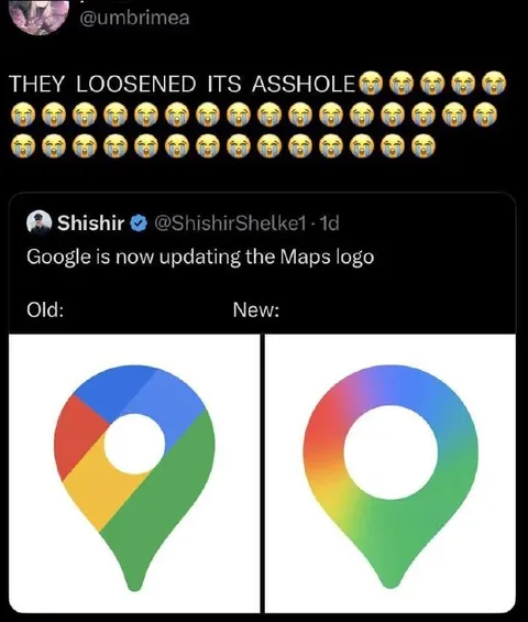
Google Maps Logo Gets Loosened
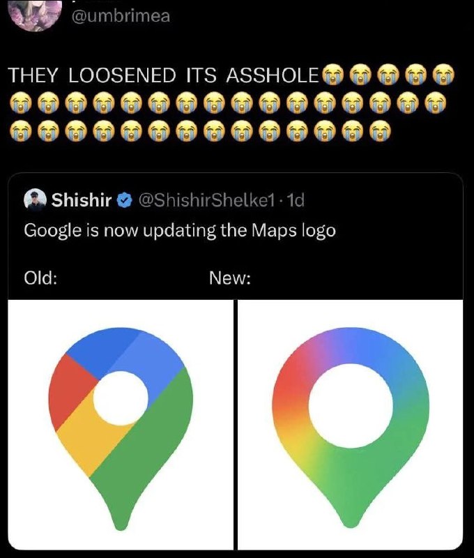
THEY LOOSENED ITS ASSHOLE 😭😭😭😭😭 😭😭😭😭😭😭😭😭😭😭😭😭😭😭😭😭 😭😭😭😭😭😭😭😭😭😭😭😭😭😭 Google is now updating the Maps logo Old: New:
A comparison shows the old and new Google Maps logos, with the new logo having a smoother, more rounded shape. The caption jokingly describes the logo’s central hole as an “asshole” that was loosened, turning a mundane branding update into an absurd reaction meme. It is sent when a redesign looks subtly different in a funny or suggestive way.
- @eternalclassic / 78411 2025-11-07
- @right_wing_dev_squads / 13263 2025-11-07
- Type
- image
- Size
- 680×800 · 70.0 KiB
- Mood
- absurd, sarcastic
- Language
- en
- Added