Pepsi Logo Design Conspiracy
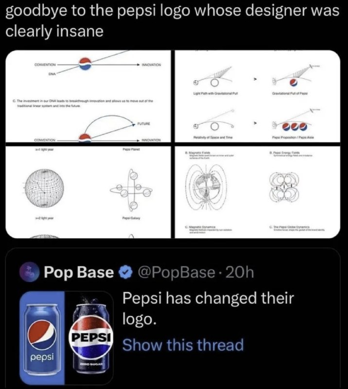
goodbye to the pepsi logo whose designer was clearly insane CONVENTION INNOVATION DNA C. The investment in our DNA leads to breakthrough innovation and allows us to move out of the traditional linear system and into the future. FUTURE CONVENTION INNOVATION Pepsi Planet Light Ray with Gravitational Pull Gravitational Pull of Pepsi Relativity of Space and Time Pepsi Proposition / Pepsi Axis Magnetic Fields Magnetic Dynamics Pepsi Galaxy Pop Base @PopBase · 20h Pepsi has changed their logo. Show this thread pepsi PEPSI ZERO SUGAR
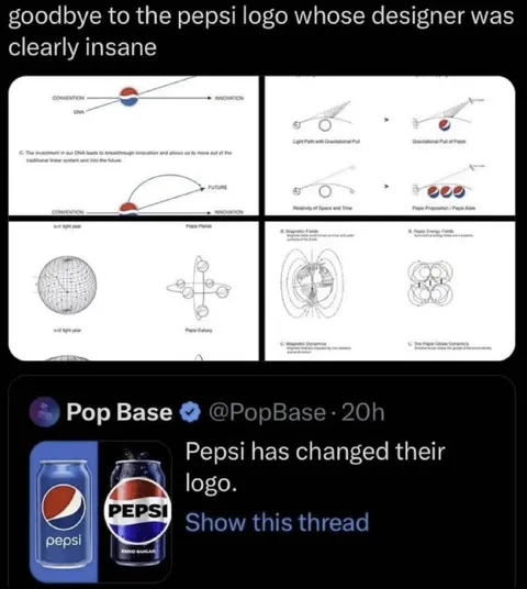
A screenshot announces that Pepsi changed its logo, alongside bizarre diagrams presenting the logo as if it were a scientific theory involving DNA, gravity, relativity, magnetic fields, planets, and galaxies. The joke is that the old Pepsi branding explanation looks absurdly overcomplicated and pseudo-scientific, so the image is used as a reaction to unnecessarily elaborate design reasoning.
Pepsi cans / банки PepsiPepsi logos / логотипы Pepsiscientific diagrams / научные диаграммыplanet diagram / схема планетыgalaxy diagram / схема галактикиmagnetic field illustration / иллюстрация магнитного поляgravity illustration / иллюстрация гравитацииtweet screenshot / скриншот твитаblue background / синий фонblack interface / чёрный интерфейсverified account badge / значок верифицированного аккаунтаtext captions / текстовые подписи
- @right_wing_dev_squads / 14678 2026-07-10
- Type
- image
- Size
- 716×800 · 71.2 KiB
- Mood
- sarcastic, absurd
- Language
- en
- Added