When Simple Apps Confuse Everyone
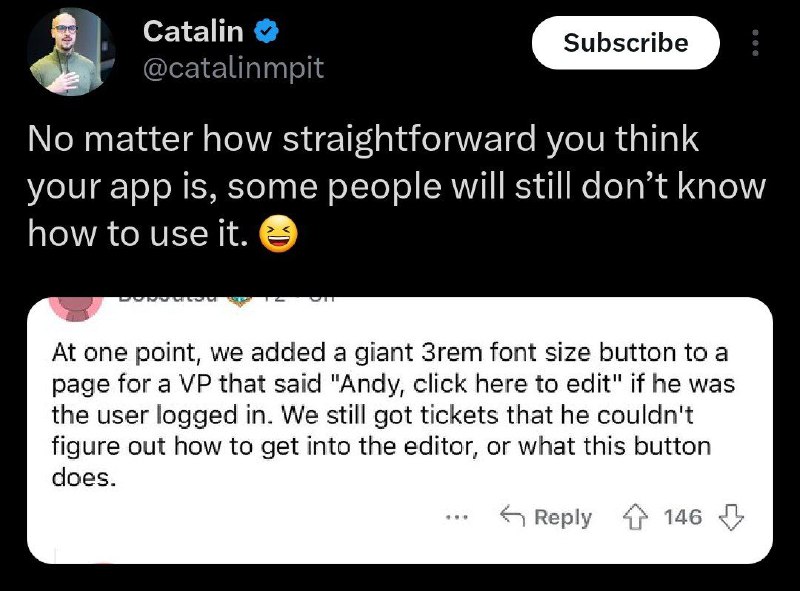
No matter how straightforward you think your app is, some people will still don’t know how to use it. 😆 At one point, we added a giant 3rem font size button to a page for a VP that said “Andy, click here to edit” if he was the user logged in. We still got tickets that he couldn’t figure out how to get into the editor, or what this button does.
A social media post jokes about how users can fail to understand even an extremely obvious interface. The embedded example describes a huge button labeled “Andy, click here to edit” that still confused a user, making it a reaction meme for baffling user behavior and excessive product simplicity. EN: A social media post jokes about how users can fail to understand even an extremely obvious interface. The embedded example describes a huge button labeled “Andy, click here to edit” that still confused a user, making it a reaction meme for baffling user behavior and excessive product simplicity.
social media post / публикация в соцсетиprofile avatar / аватар профиляverified badge / значок верификацииsubscribe button / кнопка подпискиblack background / чёрный фонwhite text / белый текстlaughing emoji / смеющийся эмодзиembedded screenshot / встроенный скриншотrounded white panel / белая панель со скруглёнными угламиinterface button / кнопка интерфейсаcomputer interface / компьютерный интерфейсreply icon / значок ответаupvote icon / значок положительной оценкиdownvote icon / значок отрицательной оценки
#user experience#пользовательский опыт#ui#интерфейс#software#программное обеспечение#developers#разработчики#confused user#растерянный пользователь#obvious button#очевидная кнопка#bad usability#плохая юзабилити#product design#дизайн продукта#reaction#реакция#screenshot#скриншот#tweet#твит#funny#смешно#пользователи#users
- @gentoomemes / 5699 2023-08-06
- Type
- image
- Size
- 800×591 · 81.4 KiB
- Mood
- sarcastic
- Language
- en
- Added