World Mortality Rate Holds Steady
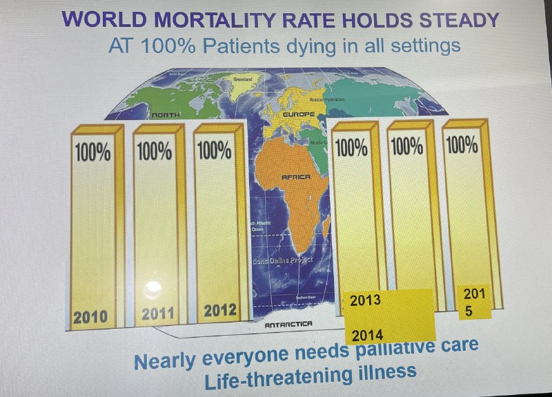
WORLD MORTALITY RATE HOLDS STEADY AT 100% Patients dying in all settings 100% 100% 100% 100% 100% 100% 2010 2011 2012 2013 2014 2015 Nearly everyone needs palliative care Life-threatening illness
A mock statistical infographic shows six nearly identical bars, each marked 100%, labeled from 2010 to 2015, over a world map. The joke is that the “world mortality rate” is perfectly steady because every patient eventually dies, making the supposedly serious chart absurdly obvious. It is sent as a dark-humor reaction to mortality, bleak statistics, or painfully obvious facts.
world map / карта мираbar chart / столбчатая диаграммаsix yellow bars / шесть жёлтых столбцовpercentage labels / обозначения процентовyears 2010–2015 / годы 2010–2015palliative care text / текст о паллиативной помощиlife-threatening illness text / текст о жизнеугрожающей болезниblue infographic text / синий текст инфографикиgreen and blue globe / зелёно-синий глобусchart background / фон диаграммы
- @memetutorial / 17279 2023-05-17
- Type
- image
- Size
- 800×576 · 114.4 KiB
- Mood
- darkly humorous
- Language
- en
- Added