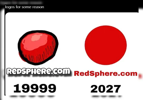
RedSphere Logo Evolution
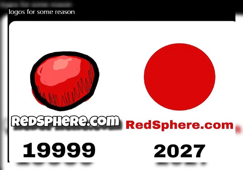
logos for some reason RedSphere.com 1999 RedSphere.com 2027
A comparison of the RedSphere.com logo in 1999 and 2027: the old logo is a roughly drawn red sphere, while the new one is a perfectly smooth red circle. The joke is the absurdly minimal and meaningless redesign, presented as if it were a major logo evolution. EN: A comparison of the RedSphere.com logo in 1999 and 2027: the old logo is a roughly drawn red sphere, while the new one is a perfectly smooth red circle. The joke is the absurdly minimal and meaningless redesign, presented as if it were a major logo evolution.
- @eternalclassic / 43173 2023-12-11
- Type
- image
- Size
- 800×560 · 50.1 KiB
- Mood
- absurd, sarcastic
- Language
- en
- Added