Wikipedia Election Map Makes No Sense
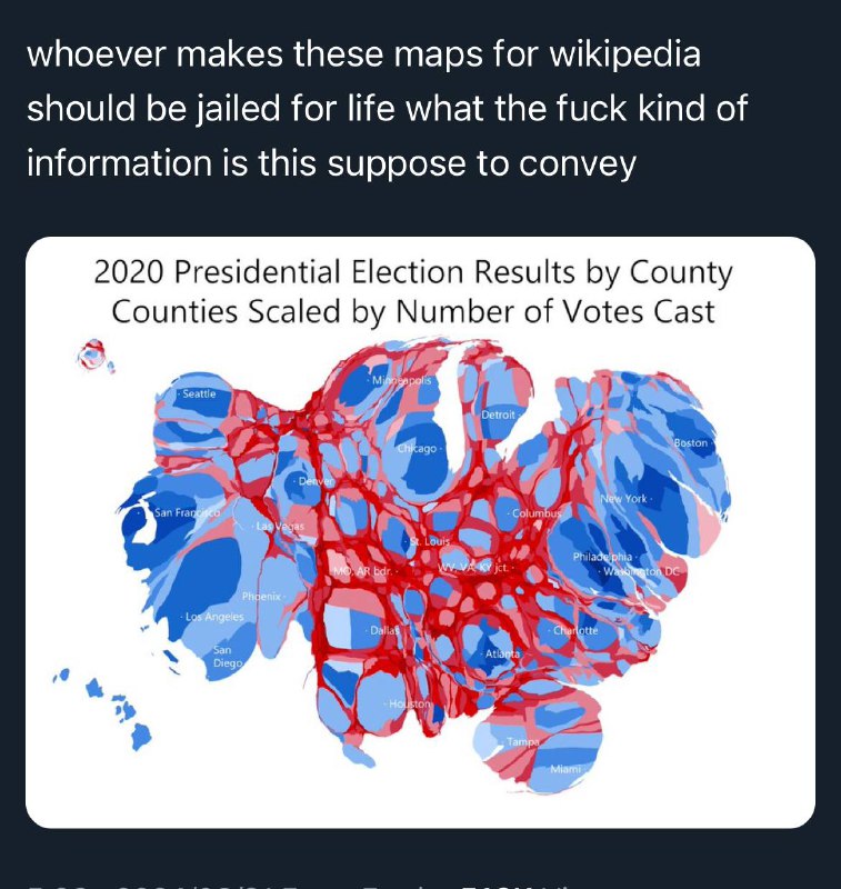
whoever makes these maps for wikipedia should be jailed for life what the fuck kind of information is this suppose to convey 2020 Presidential Election Results by County Counties Scaled by Number of Votes Cast Seattle Minneapolis Detroit Chicago Boston San Francisco Las Vegas Denver Columbus New York Philadelphia Washington DC Los Angeles Phoenix San Diego St. Louis Charlotte Atlanta Dallas Houston Tampa Miami
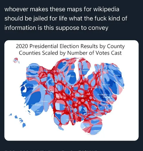
A distorted red-and-blue map titled “2020 Presidential Election Results by County,” with counties scaled by the number of votes cast and major cities labeled. The caption angrily complains that the map is so distorted that it conveys almost no useful geographic information, turning a data visualization into an absurd reaction meme. EN: A distorted red-and-blue map titled “2020 Presidential Election Results by County,” with counties scaled by the number of votes cast and major cities labeled. The caption angrily complains that the map is so distorted that it conveys almost no useful geographic information, turning a data visualization into an absurd reaction meme.
distorted election map / искажённая карта выборовred counties / красные округаblue counties / синие округаUnited States map / карта СШАcity labels / подписи городовdata visualization / визуализация данныхwhite rounded panel / белая панель с закруглёнными угламиdark background / тёмный фонelection results / результаты выборовgeographic distortion / географическое искажение
- @pokupkabitka / 37589 2024-03-21
- Type
- image
- Size
- 757×800 · 112.9 KiB
- Mood
- angry absurd
- Language
- en
- Added