Robussy Logo Redesign
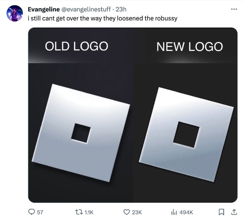
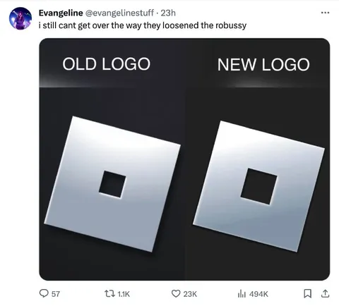
i still cant get over the way they loosened the robussy OLD LOGO NEW LOGO
A side-by-side comparison shows an old and new logo made from tilted silver squares, with the hole in the new logo noticeably larger. The joke is the sexualized slang “robussy,” implying that the logo redesign made the Roblox logo look more anatomically suggestive. It is used as an absurd reaction to a controversial or funny logo change. EN: A side-by-side comparison shows an old and new logo made from tilted silver squares, with the hole in the new logo noticeably larger. The joke is the sexualized slang “robussy,” implying that the logo redesign made the Roblox logo look more anatomically suggestive. It is used as an absurd reaction to a controversial or funny logo change.
- Type
- image
- Size
- 800×724 · 48.1 KiB
- Mood
- absurd, sarcastic
- Language
- en
- Added