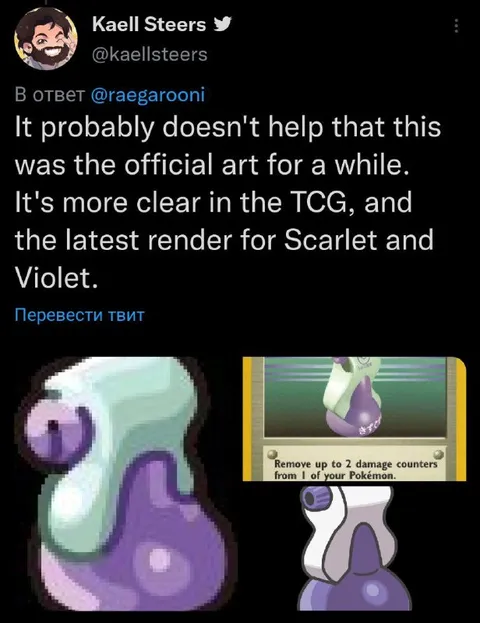
Official Art Looks Completely Different
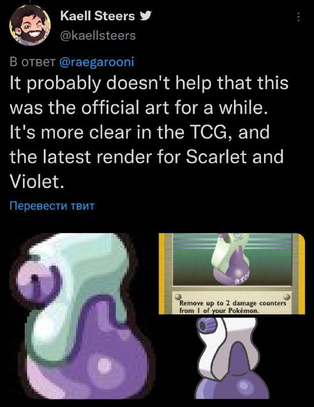
It probably doesn't help that this was the official art for a while. It's more clear in the TCG, and the latest render for Scarlet and Violet. Remove up to 2 damage counters from 1 of your Pokémon.
A tweet compares the Pokémon’s strange, blurry official artwork with its clearer Trading Card Game illustration and the latest Scarlet and Violet render. The joke is that the Pokémon looked so different in its older art that the comparison makes the original design seem absurd; this is used as a reaction to confusing or inconsistent artwork.
purple Pokémon / фиолетовый покемонgreen-and-purple creature / зелёно-фиолетовое существоPokémon trading card / коллекционная карта Pokémoncard frame / рамка картыofficial artwork / официальная иллюстрацияgame render / игровой рендерTwitter post / публикация в Twitterblack background / чёрный фонwhite text / белый текстpurple spots / фиолетовые пятна
- @ithueti / 8349 2022-12-05
- Type
- image
- Size
- 616×800 · 79.6 KiB
- Mood
- absurd, confused
- Language
- en
- Added