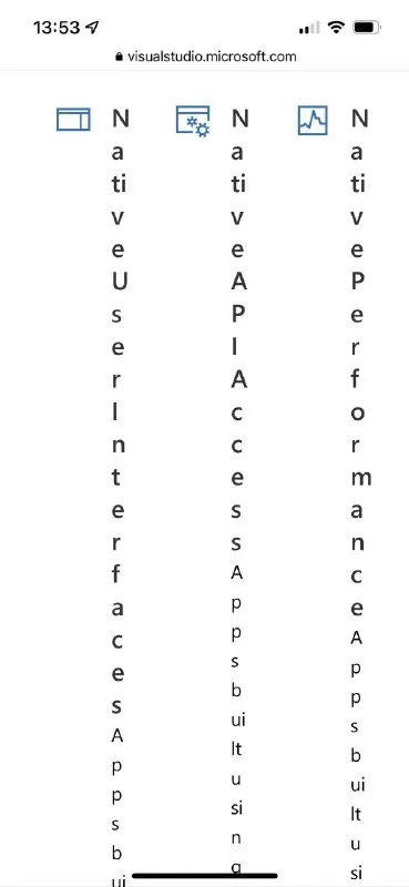
Broken Responsive Layout Columns
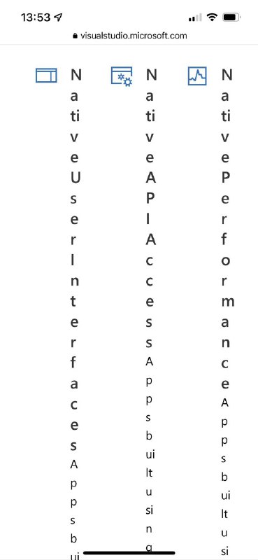
Native User Interfaces Apps bui Native APIs Apps built using Native Performance Apps built using
A mobile webpage displays three feature headings in extremely narrow columns, forcing every word to break one letter per line. The joke is the absurdly broken responsive layout, where ordinary labels become almost unreadable; this is shared as a reaction to terrible mobile web design. EN: A mobile webpage displays three feature headings in extremely narrow columns, forcing every word to break one letter per line. The joke is the absurdly broken responsive layout, where ordinary labels become almost unreadable; this is shared as a reaction to terrible mobile web design.
smartphone screenshot / скриншот смартфонаmobile webpage / мобильная веб-страницаbrowser address bar / адресная строка браузераfeature icons / иконки функцийthree narrow columns / три узкие колонкиvertically broken text / вертикально сломанный текстblue interface icons / синие иконки интерфейсаwhite background / белый фонstatus bar / строка состоянияhamburger-like text columns / узкие текстовые колонки
- @ithueti / 6317 2022-05-18
- Type
- image
- Size
- 369×800 · 22.3 KiB
- Mood
- absurd, sarcastic
- Language
- en
- Added