Эволюция логотипа Chrome
2014 2022
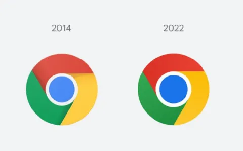
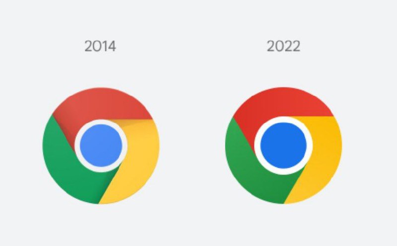
Сравнение логотипов Google Chrome за 2014 и 2022 годы: внешний вид почти не изменился, но центральный синий круг стал заметно крупнее. Шутка обыгрывает ощущение, что обновление дизайна лишь усилило сходство логотипа с глазом или другой круглой частью тела. EN: A comparison of the Google Chrome logos from 2014 and 2022: the design has barely changed, but the central blue circle has become noticeably larger. The joke plays on the impression that the redesign only made the logo look more like an eye or another round body part.
Google Chrome logo / логотип Google Chrome2014 logo / логотип 2014 года2022 logo / логотип 2022 годаblue circle / синий кругred section / красная секцияgreen section / зелёная секцияyellow section / жёлтая секцияcomparison layout / сравнительная композицияwhite background / белый фонyear labels / обозначения годов
- @ithueti / 5674 2022-02-08
- Type
- image
- Size
- 800×497 · 20.8 KiB
- Mood
- саркастичный, абсурдный
- Added