Virgin 2019 Website vs Chad 2000 Website
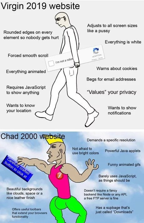
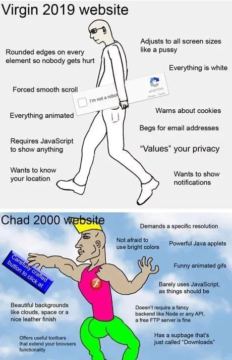
Virgin 2019 website Rounded edges on every element so nobody gets hurt Adjusts to all screen sizes like a pussy Everything is white Forced smooth scroll Everything animated Warns about cookies Requires JavaScript to show anything Begs for email addresses “Values” your privacy Wants to know your location Wants to show notifications I'm not a robot reCAPTCHA Chad 2000 website Demands a specific resolution Not afraid to use bright colors Powerful Java applets Funny animated gifs Barely uses JavaScript, as things should be Beautiful backgrounds like clouds, space or a nice leather finish Doesn't require a fancy backend like Node or any API, a free FTP server is fine Offer useful toolbars that extend your browsers functionality Has a webpage that's just called “Downloads” Carefully crafted button to click at
A two-panel Virgin-versus-Chad comparison contrasts a timid, overcomplicated modern website with a colorful, confident early-2000s website. The top panel mocks responsive design, cookie warnings, JavaScript dependence, privacy prompts and excessive animations, while the bottom panel celebrates bright backgrounds, Java applets, animated GIFs, toolbars and a simple “Downloads” page. The joke is a nostalgic reaction to old web design being portrayed as more fun and straightforward than modern web development. EN: A two-panel Virgin-versus-Chad comparison contrasts a timid, overcomplicated modern website with a colorful, confident early-2000s website. The top panel mocks responsive design, cookie warnings, JavaScript dependence, privacy prompts and excessive animations, while the bottom panel celebrates bright backgrounds, Java applets, animated GIFs, toolbars and a simple “Downloads” page. The joke is a nostalgic reaction to old web design being portrayed as more fun and straightforward than modern web development.
- @ithueti / 5384 2021-12-29
- Template
- Virgin vs. Chad
- Type
- image
- Size
- 460×712 · 64.5 KiB
- Mood
- nostalgic, sarcastic
- Language
- en
- Added