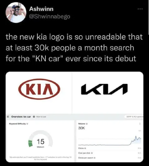
The New Kia Logo Looks Like KN
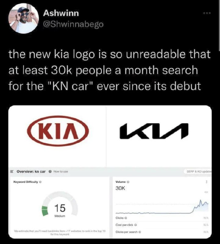
the new kia logo is so unreadable that at least 30k people a month search for the "KN car" ever since its debut
A tweet jokes that Kia’s redesigned logo is so difficult to read that thousands of people search for “KN car” every month. The joke comes from mistaking the stylized KIA logo for the letters KN, as shown alongside search-volume data. EN: A tweet jokes that Kia’s redesigned logo is so difficult to read that thousands of people search for “KN car” every month. The joke comes from mistaking the stylized KIA logo for the letters KN, as shown alongside search-volume data.
man wearing sunglasses / мужчина в солнцезащитных очкахsocial media profile photo / фотография профиля в соцсетиtweet screenshot / скриншот твитаKia logo / логотип Kiared oval / красный овалstylized KN logo / стилизованный логотип KNsearch analytics dashboard / панель поисковой аналитикиkeyword difficulty chart / график сложности ключевого словаvolume chart / график объёма поискаwhite interface panel / белая панель интерфейса
- @antichirst / 15794 2024-02-21
- Type
- image
- Size
- 721×800 · 59.0 KiB
- Mood
- sarcastic, absurd
- Language
- en
- Added