Metal Band Logos Be Like
Metal band logos be like:
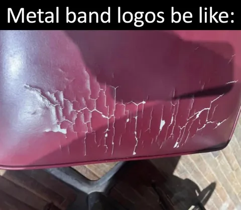
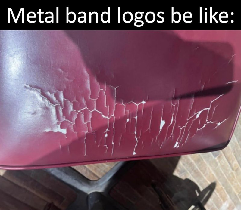
A close-up of a maroon surface covered in chaotic white cracks that resemble an unreadable metal band logo. The joke is that extreme metal band logos are often so intricate and illegible that even random damage can look like one; this is shared as a reaction to overly complicated band branding.
- @afrosidemoon / 48349 2022-05-12
- Type
- image
- Size
- 800×698 · 74.8 KiB
- Mood
- absurd, sarcastic
- Language
- en
- Added