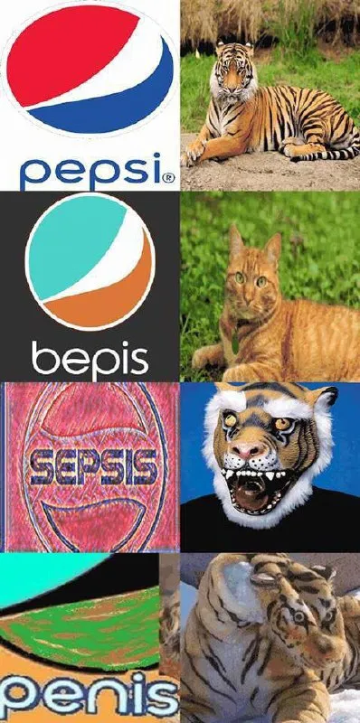
Pepsi Logo Gets Progressively Worse
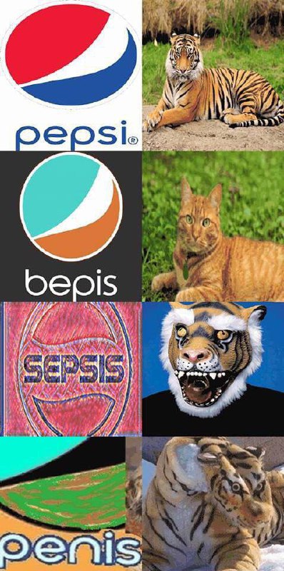
pepsi® bepis SEPISIS penis
A four-panel joke shows increasingly distorted Pepsi-style logos paired with progressively stranger tiger images. The final logo reads “penis,” turning a familiar brand design into childish absurdity. It is used as a reaction to escalating nonsense or a badly corrupted version of something. EN: A four-panel joke shows increasingly distorted Pepsi-style logos paired with progressively stranger tiger images. The final logo reads “penis,” turning a familiar brand design into childish absurdity. It is used as a reaction to escalating nonsense or a badly corrupted version of something.
Pepsi logo / логотип Pepsidistorted logo / искажённый логотипtiger / тигрorange cat / рыжий котtiger face illustration / иллюстрация морды тиграfour-panel collage / коллаж из четырёх панелейgrass / траваdirt / земляblack background / чёрный фонblue shape / синяя формаred shape / красная формаwhite stripe / белая полосаorange shape / оранжевая форма
- @afrosidemoon / 20992 2019-12-06
- Type
- image
- Size
- 398×800 · 100.2 KiB
- Mood
- absurd
- Language
- en
- Added