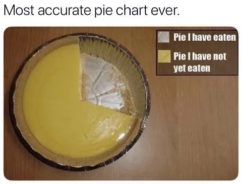
Most Accurate Pie Chart
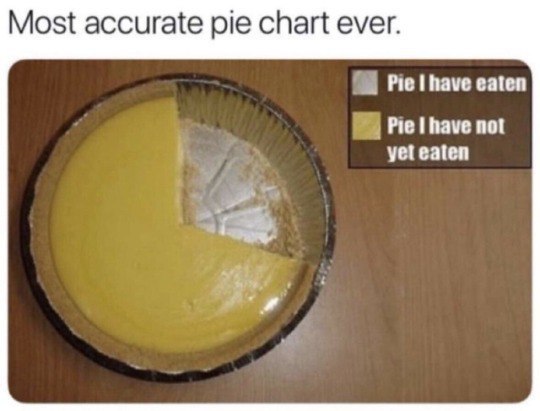
Most accurate pie chart ever. Pie I have eaten Pie I have not yet eaten
A pie chart is shown as an actual pie, with most of it eaten and a small slice remaining. The joke is that the chart’s data is represented literally, making it an accurate pie chart. It is used as a playful reaction to jokes about eating, pie, or overly literal interpretations.
- @afrosidemoon / 6661 2018-12-10
- Type
- image
- Size
- 540×411 · 36.5 KiB
- Mood
- literal, playful
- Language
- en
- Added