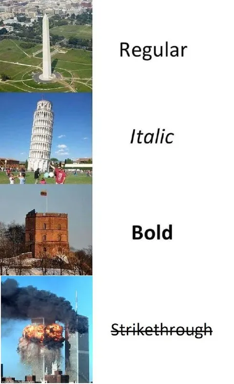
Monuments as Font Styles
Regular Italic Bold Strikethrough
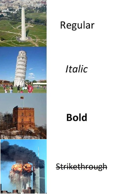
A four-panel meme compares famous monuments to text formatting styles: the upright Washington Monument is “Regular,” the Leaning Tower of Pisa is “Italic,” a sturdy brick tower is “Bold,” and the burning Twin Towers are “Strikethrough.” The joke relies on visual wordplay, matching each monument’s appearance or fate to a familiar typography option, and is used as an absurd reaction meme about formatting or destruction. EN: A four-panel meme compares famous monuments to text formatting styles: the upright Washington Monument is “Regular,” the Leaning Tower of Pisa is “Italic,” a sturdy brick tower is “Bold,” and the burning Twin Towers are “Strikethrough.” The joke relies on visual wordplay, matching each monument’s appearance or fate to a familiar typography option, and is used as an absurd reaction meme about formatting or destruction.
- @afrosidemoon / 6622 2018-12-09
- Template
- Font styles meme
- Type
- image
- Size
- 487×800 · 60.8 KiB
- Mood
- absurd, dark humor
- Language
- en
- Added