Old Interface Versus Frutiger Aero
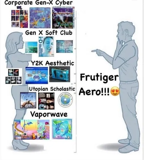
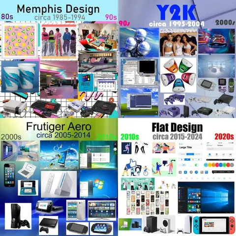
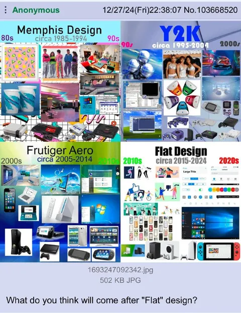
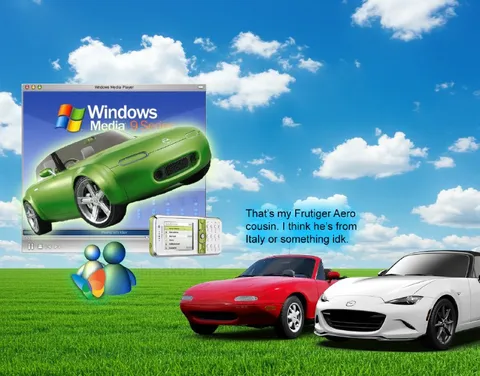
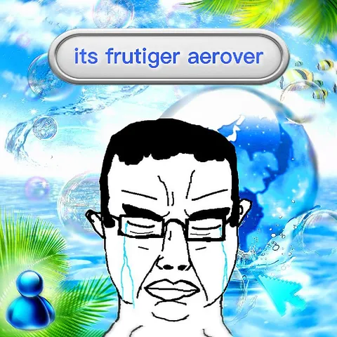
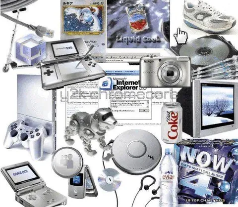
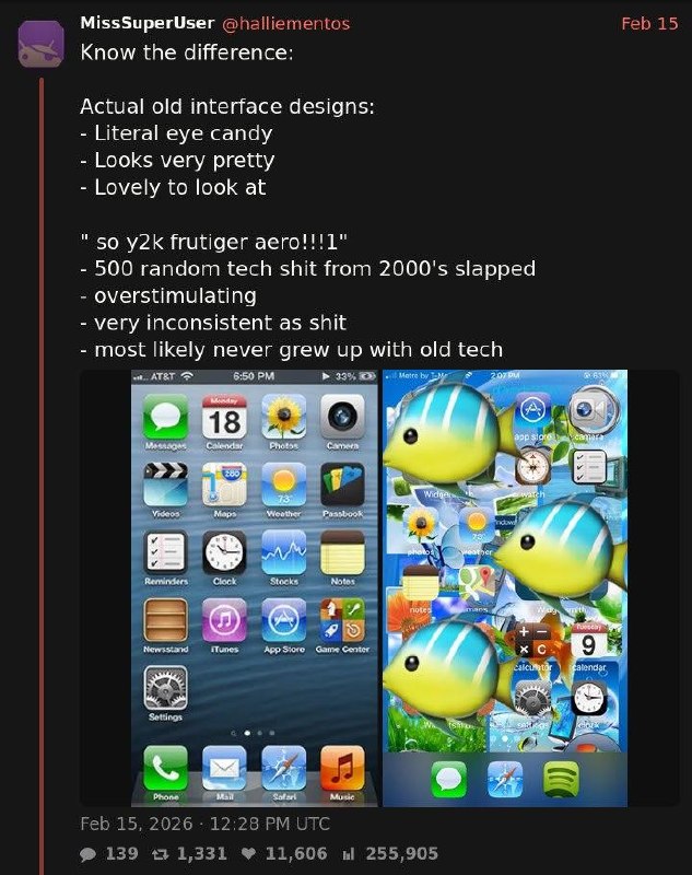
Know the difference: Actual old interface designs: - Literal eye candy - Looks very pretty - Lovely to look at " so y2k frutiger aero!!!!1" - 500 random tech shit from 2000's slapped - overstimulating - very inconsistent as shit - most likely never grew up with old tech
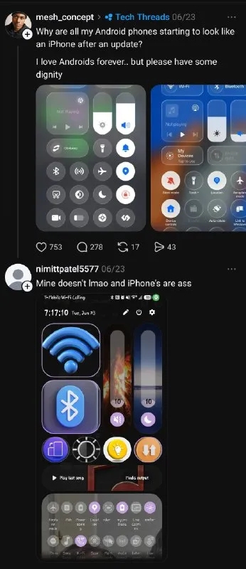
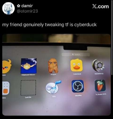
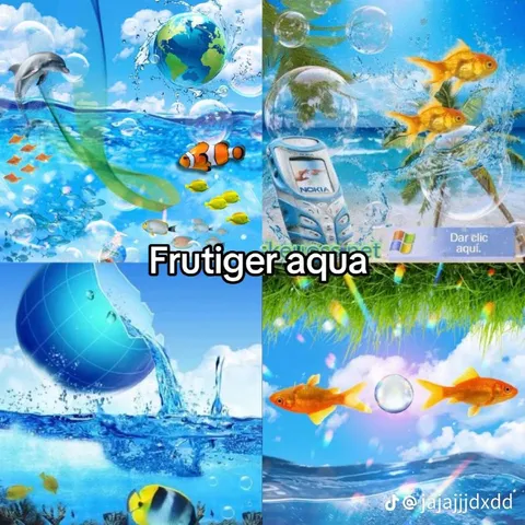
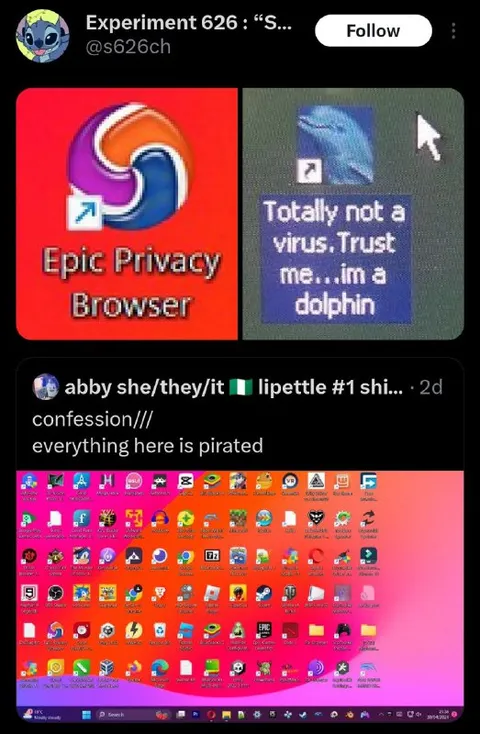
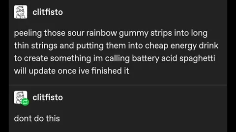
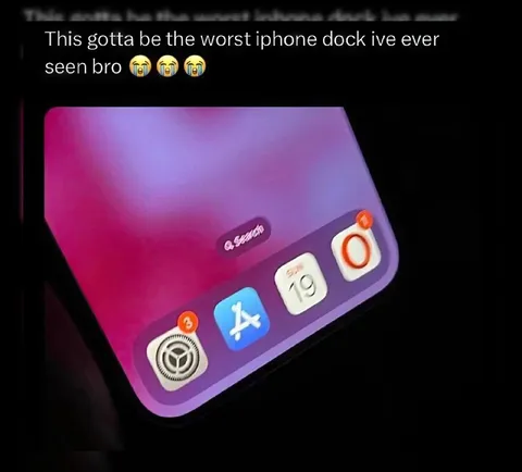
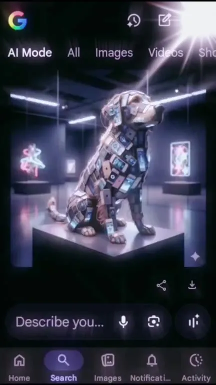
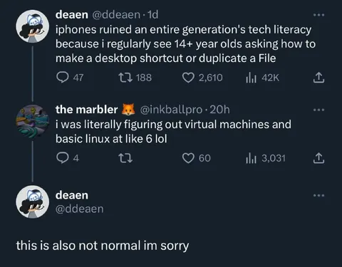
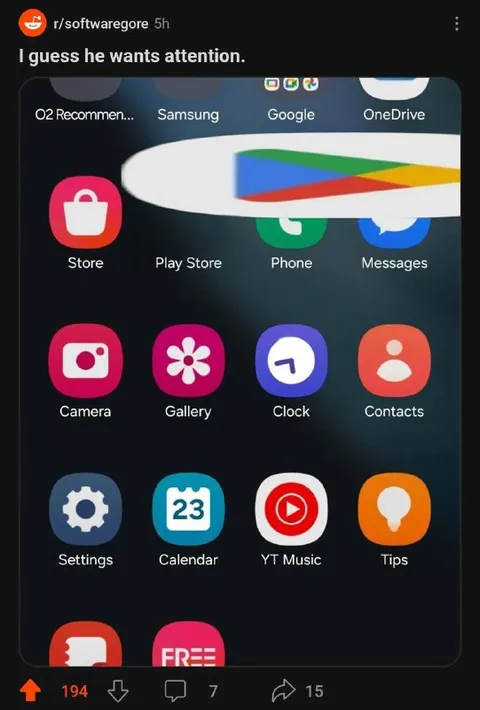
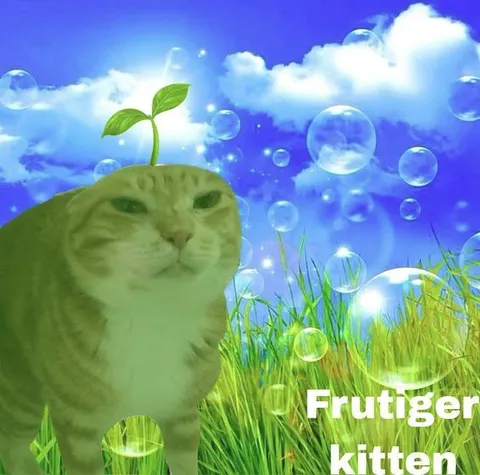
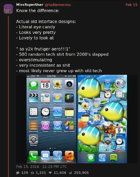
A screenshot compares thoughtfully designed old interface aesthetics with an exaggerated Frutiger Aero collage full of random technology, fish and icons. The joke mocks overstimulating Y2K nostalgia that combines every early-2000s visual element without the consistency or lived experience of the original designs. It is used as a reaction to overly cluttered retro-futurist or nostalgic design.
smartphone interface / интерфейс смартфонаapp icons / иконки приложенийblue sky / голубое небоgreen grass / зелёная траваtropical fish / тропические рыбкиwater bubbles / пузырьки в водеcalendar icon / иконка календаряcamera icon / иконка камерыmusic icon / иконка музыкиweather icon / иконка погодыclock icon / иконка часовsettings icon / иконка настроекocean wallpaper / обои с океаном
- @gentoomemes / 20100 2026-02-16
- @dev_meme / 7869 2026-03-27
- Type
- image
- Size
- 633×800 · 111.9 KiB
- Mood
- sarcastic, nostalgic
- Language
- en
- Added