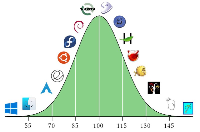
Linux Distribution Bell Curve
void S 55 70 85 100 115 130 145
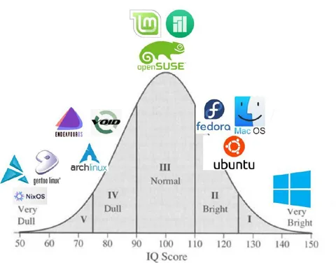
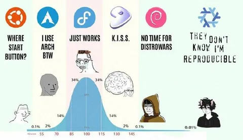
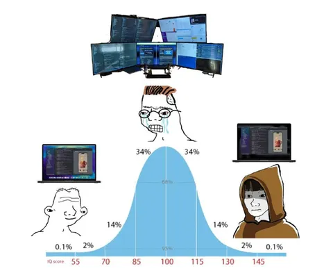
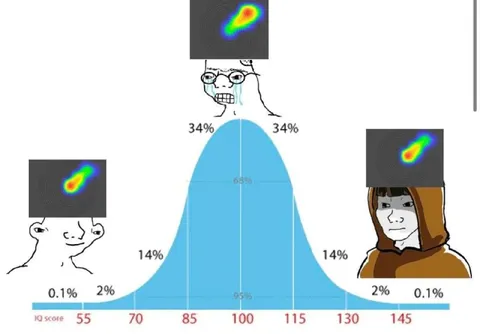
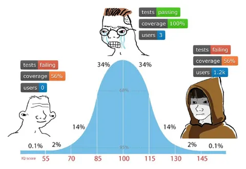
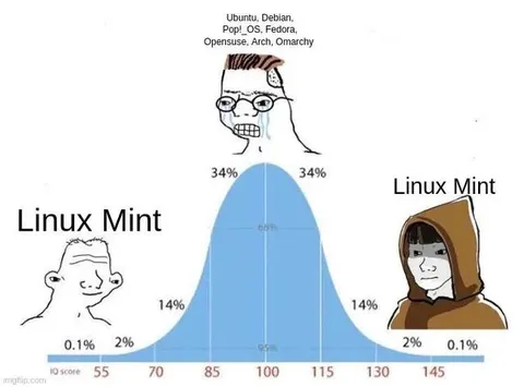
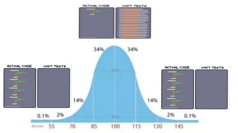
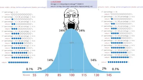
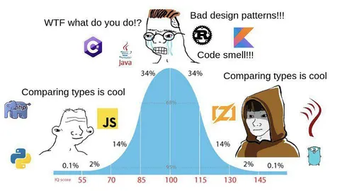
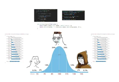
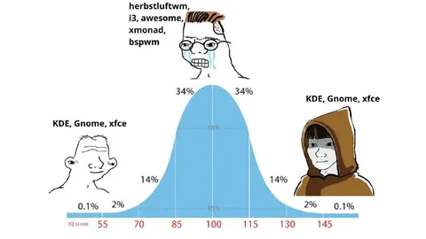
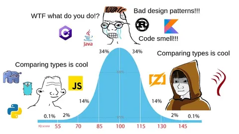
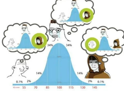
A bell-curve chart compares Linux distributions by an implied level of user sophistication, with beginner-friendly systems at the edges and a cluster of distributions around the middle. The joke uses the bell curve to humorously portray different Linux choices as stages of technical knowledge and taste. EN: A bell-curve chart compares Linux distributions by an implied level of user sophistication, with beginner-friendly systems at the edges and a cluster of distributions around the middle. The joke uses the bell curve to humorously portray different Linux choices as stages of technical knowledge and taste.
bell curve chart / график колоколообразной кривойLinux distribution logos / логотипы дистрибутивов LinuxWindows logo / логотип WindowsmacOS Finder logo / логотип Finder macOSArch Linux logo / логотип Arch LinuxUbuntu logo / логотип UbuntuFedora logo / логотип FedoraDebian logo / логотип DebianVoid Linux logo / логотип Void LinuxFreeBSD daemon logo / логотип FreeBSDgreen curve / зелёная криваяhorizontal axis / горизонтальная осьnumeric scale / числовая шкалаwhite background / белый фон
- @gentoomemes / 936 2022-09-18
- @right_wing_dev_squads / 9559 2024-05-03
- @gentoomemes / 21227 2026-06-27
- Template
- IQ bell curve
- Type
- image
- Size
- 800×531 · 38.4 KiB
- Mood
- саркастичный, абсурдный
- Language
- en
- Added