Designers Prioritise Aesthetics Over Usability
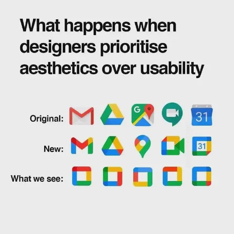
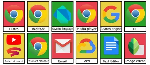
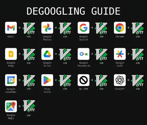
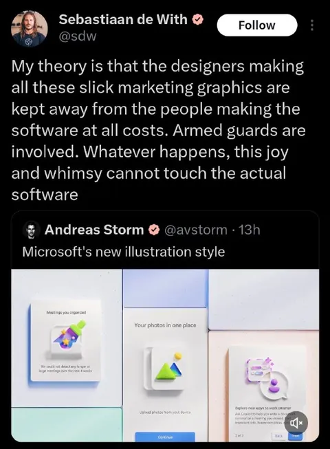
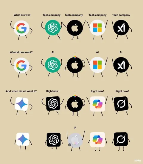
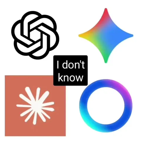
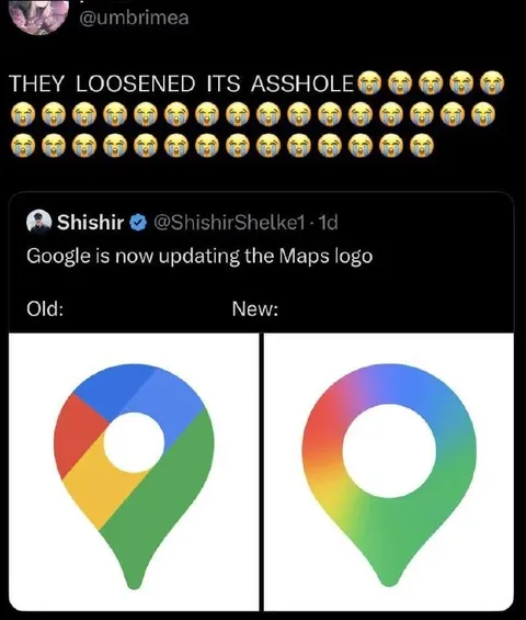
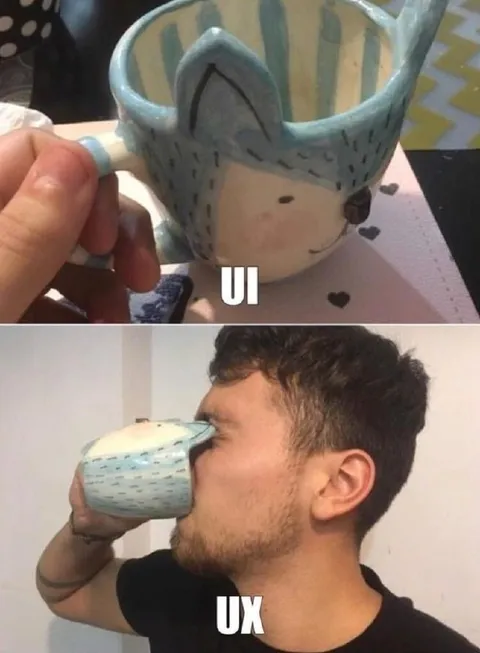
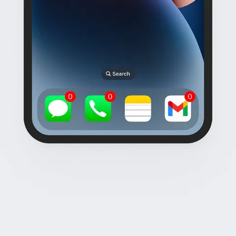
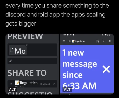
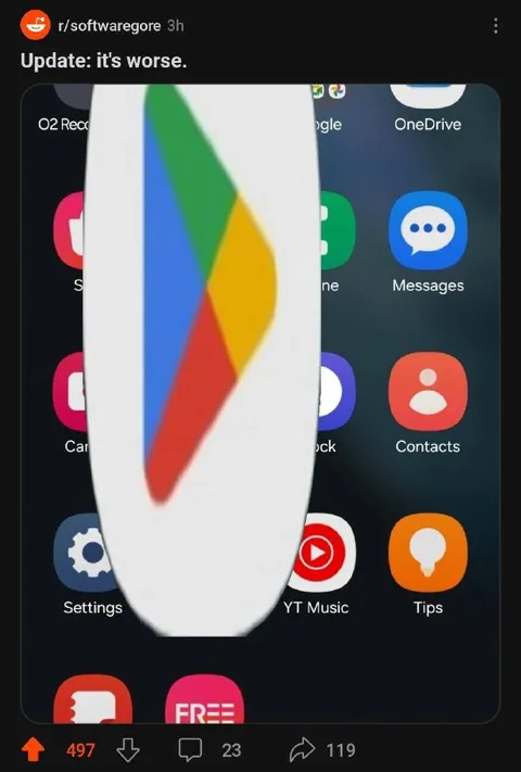
What happens when designers prioritise aesthetics over usability Original: New: What we see:
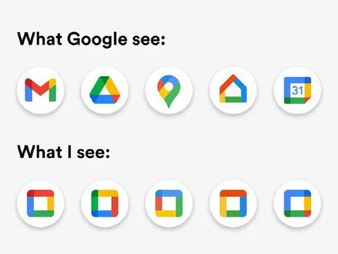
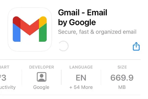
The meme compares original Google app icons with their redesigned versions, then shows a row of nearly indistinguishable colorful rounded-square icons. The joke is that prioritizing visual aesthetics over usability makes the icons difficult to tell apart, turning a polished redesign into a confusing user experience.
Google app icons / значки приложений GoogleGmail icon / значок GmailGoogle Drive icon / значок Google ДискаGoogle Maps icon / значок Google КартGoogle Meet icon / значок Google MeetGoogle Calendar icon / значок Google Календаряcolorful rounded-square icons / разноцветные значки с закруглёнными угламиtext labels / текстовые подписиwhite background / белый фон
- @gentoomemes / 1903 2023-01-13
- @right_wing_dev_squads / 6752 2023-05-20
- Type
- image
- Size
- 800×758 · 71.2 KiB
- Mood
- sarcastic
- Language
- en
- Added