Google Icons Lost Their Usability
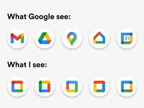
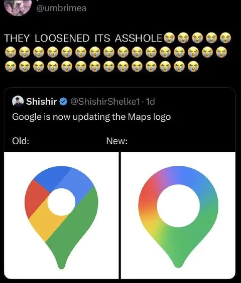
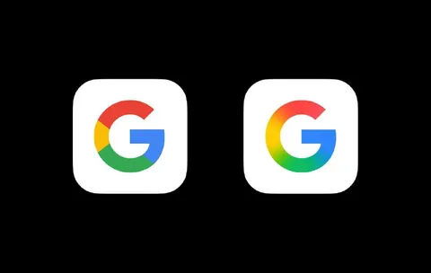
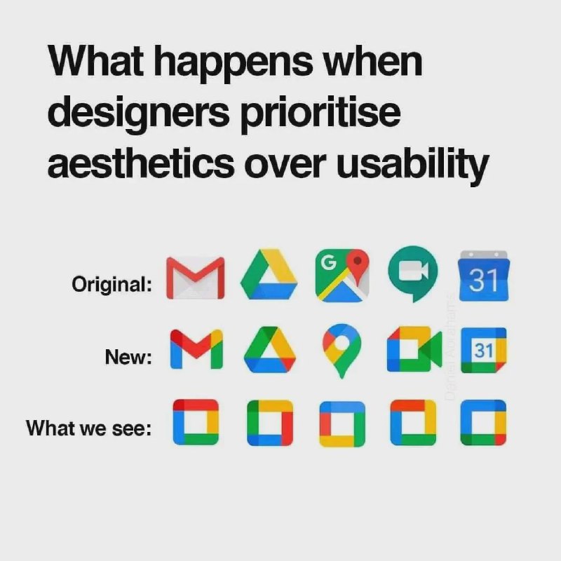
What happens when designers prioritise aesthetics over usability Original: New: What we see:
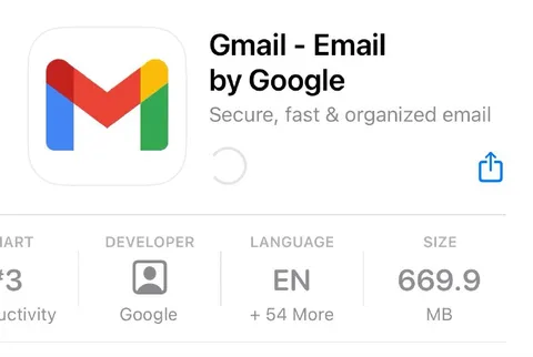
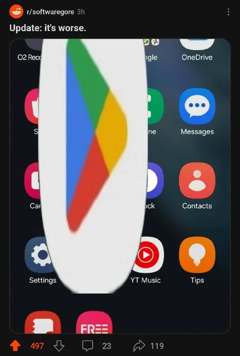
The image compares the original Google app icons with their redesigned versions, followed by a row of nearly identical multicoloured square icons. The joke is that prioritising visual aesthetics makes the apps impossible to distinguish, so users can no longer tell which icon belongs to which service.
text labels / текстовые подписиGmail icon / значок GmailGoogle Drive icon / значок Google ДискаGoogle Maps icon / значок Google КартGoogle Meet icon / значок Google MeetGoogle Calendar icon / значок Google Календаряmulticoloured square icons / разноцветные квадратные значкиGoogle logo colours / цвета логотипа Googlewhite background / белый фон
- @profunctor_io / 10757 2025-03-27
- Type
- image
- Size
- 800×800 · 63.8 KiB
- Mood
- sarcastic
- Language
- en
- Added