HP Packaging Points Both Ways
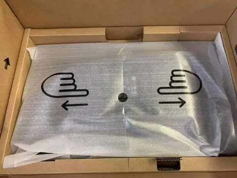
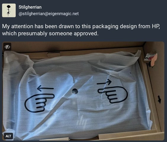
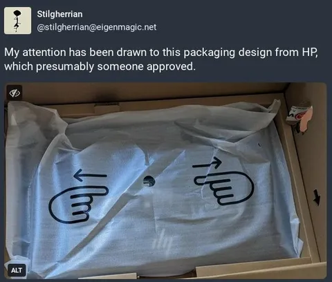
My attention has been drawn to this packaging design from HP, which presumably someone approved.
A photograph shows HP packaging with two large hand icons pointing in opposite directions, creating a confusing and unintentionally funny design. The joke is that the packaging’s attention-grabbing arrows compete with each other, suggesting that someone approved a bizarre visual choice. It is shared as a reaction to confusing design, poor decisions, or corporate absurdity.
- @rzeczyzabawne / 16905 2024-06-11
- Type
- image
- Size
- 564×479 · 52.0 KiB
- Mood
- саркастичный, абсурдный
- Language
- en
- Added