Apple Icons Reverse Portfolio
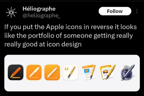
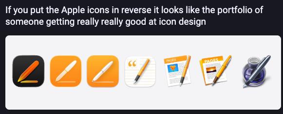
If you put the Apple icons in reverse it looks like the portfolio of someone getting really really good at icon design
A row of Apple design-related icons is shown in reverse order, progressing from a polished illustration to simpler-looking tools. The joke is that reversing the icons makes them resemble the portfolio of a designer who is gradually becoming better at icon design. People might send it as a humorous reaction to improvement, progression, or unexpectedly clever visual analysis.
Apple design icons / иконки дизайна Appleblack drawing tablet icon / чёрная иконка графического планшетаorange pencil icon / оранжевая иконка карандашаwhite pen icon / белая иконка ручкиnotebook / блокнотdocument pages / страницы документаpurple ink bottle / фиолетовая бутылка чернилpen nib / перо ручкиwhite rounded panel / белая панель с закруглёнными угламиblack background / чёрный фон
- @profunctor_io / 11325 2026-01-18
- @ithueti / 17568 2026-01-18
- @eternalclassic / 82142 2026-01-20
- Type
- image
- Size
- 581×235 · 18.7 KiB
- Mood
- witty, sarcastic
- Language
- en
- Added